Expressive Typography: In a world where the flow of information is accelerating and means of communication are multiplying, visual design emerges as a crucial element in capturing attention and conveying messages effectively. Within this dynamic landscape, letters, which might seem like mere tools for transmitting words, take on a new dimension and increasing importance. Letters are no longer just silent symbols on a page or screen but have transformed into powerful expressive tools, capable of evoking emotions, embodying meanings, and even narrating stories. This is where expressive typography comes into play—an art that elevates letters from mere reading elements to true heroes in the world of design.
Expressive typography is a design approach that focuses on using font properties and arranging them in innovative ways to convey a certain message or feeling that goes beyond the literal meaning of the words. It’s not just about choosing a beautiful font, but rather a meticulous process involving manipulation of size, color, spacing, composition, and even motion, to create a rich and impactful visual experience. In this article, we will delve deeper into understanding this art, exploring its history, elements, diverse applications, and how designers can master it to make letters true heroes in their creative works.
What is Expressive Typography?

To understand the essence of expressive typography, one must realize that it transcends the basic function of letters, which is to convey information. It is an art aimed at imbuing text with personality and emotion, making it speak louder and more powerfully. Expressive typography can be defined as the creative use of fonts, sizes, colors, spacing, and visual compositions of letters and words, with the goal of enhancing meaning, evoking emotions, or conveying a specific message in an innovative visual manner.
The fundamental difference between traditional and expressive typography lies in the objective. While traditional typography focuses on clarity and ease of reading, expressive typography seeks to achieve a visual and emotional impact, sometimes even at the expense of some aspects of clarity. It doesn’t just present the text; it makes it an integral part of the overall design, reflecting the mood, tone, or even the speaker’s voice. For example, the word “scream” could be designed with sharp, large, and spaced-out fonts to reflect the intensity of the sound, while the word “whisper” might be written with thin, small, and closely spaced fonts to suggest calmness and secrecy. This is the power of expressive typography.
The essential elements of expressive typography include:
- Font Selection: The type of font (Serif, Sans-serif, Script, Display) carries different visual and psychological connotations.
- Size and Weight: Manipulating the size and thickness (light, regular, bold) of letters can highlight specific words or create a visual hierarchy.
- Spacing: Spacing between letters (Kerning), words (Tracking), and lines (Leading) significantly affects readability and overall appearance.
- Color and Contrast: The use of colors and contrast can add another layer of meaning and emotion to the text.
- Composition and Layout: How letters and words are arranged in space—whether straight, curved, overlapping, or scattered—creates unique visual effects.
- Visual Effects: Adding shadows, textures, or 3D effects can enhance the expressiveness of letters.
History and Evolution of Expressive Typography

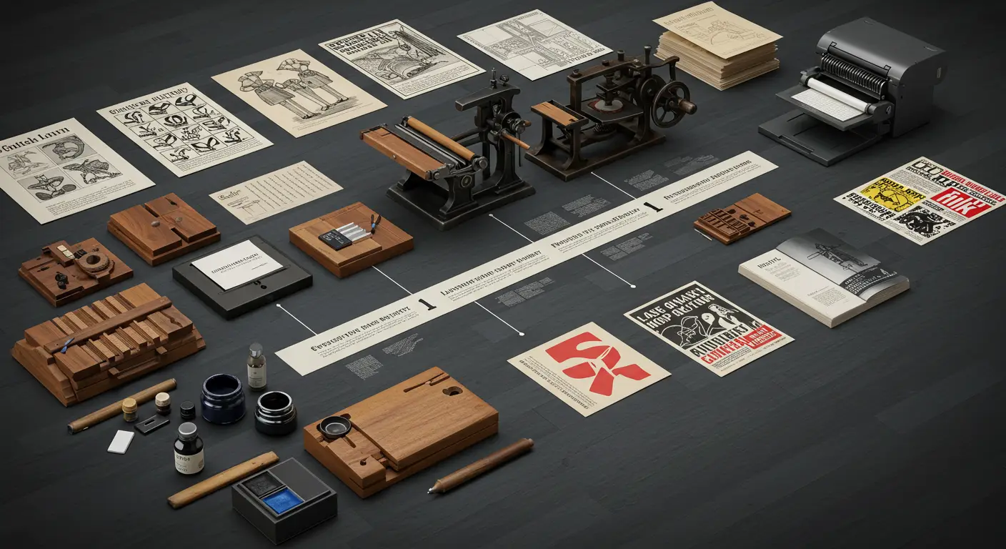
Expressive typography did not suddenly appear in the modern era; it has deep roots extending through the history of art and design. Its beginnings can be traced back to ancient times when writing itself was a form of visual art. In ancient Egyptian civilizations, hieroglyphics combined images and text to convey meaning in a visually rich way. In Islamic art, Arabic calligraphy evolved into an art form in itself, where the aesthetics of letters transcend their reading function to become expressions of spirituality and beauty. With the invention of printing by Johannes Gutenberg in the 15th century, focus shifted to clarity and standardization to ensure easy reading and mass production. However, the expressive aspect of letters never completely disappeared. In the Baroque and Rococo eras, ornate scripts emerged, reflecting elegance and luxury. In the 19th century, with the advent of printed advertisements, fonts began to take on bolder and more varied forms to attract attention.
The 20th century witnessed a radical shift in the concept of expressive typography. With the emergence of artistic movements such as Futurism and Dadaism in the early century, artists and designers began breaking the traditional rules of typography. They used letters as abstract visual elements, manipulating size, direction, and spacing to create dynamic compositions that reflected chaos, speed, or extreme emotions. For instance, Dadaist artists used collage and fragmented fonts to reflect their rejection of traditional values and the chaos following World War I.
In the mid-20th century, with the rise of the Swiss design school (International Typographic Style), focus returned to clarity and simplicity, but even within this context, there were subtle expressive touches in the use of grids and clean layouts. With the advent of computers and digital design software in the late 20th century, the possibilities of expressive typography exploded. Designers became able to manipulate letters in ways that were previously impossible, opening new horizons for creativity and experimentation. Today, expressive typography continues to evolve, influenced by new technologies like augmented reality and virtual reality, making letters interact with users in ways we couldn’t have imagined before.
Basic Elements of Expressive Typography

The effectiveness of expressive typography depends on a deep understanding of the elements that constitute letters and texts and how they can be manipulated to create visual and psychological effects. These elements go beyond simply choosing a font, encompassing every aspect of the visual composition of the text:
- Fonts and Shapes: Choosing the appropriate font is the cornerstone of expressive typography. Each font carries within it a certain personality, history, and set of connotations. Fonts with sharp edges may suggest strength and seriousness, while rounded fonts may express gentleness and kindness. Classic fonts may symbolize heritage and authenticity, whereas modern fonts reflect innovation and contemporaneity. Manipulating the shape of the letter itself, such as stretching, compressing, or artistically distorting it, can add a unique expressive dimension.
- Colors and Contrast: Colors play a vital role in enhancing the expressive message of letters. Warm colors (like red and orange) can evoke feelings of excitement and energy, while cool colors (like blue and green) may suggest calmness and tranquility. The contrast between the text color and the background color is essential for ensuring clarity, but it can also be used to create dramatic effects or to highlight specific parts of the text. For example, using light text on a dark background can give a sense of luxury or mystery.
- Layout and Composition: Layout and composition refer to how letters, words, and paragraphs are arranged within the available space. The composition can be balanced and symmetrical to provide a sense of stability and harmony, or asymmetrical to create dynamism and visual tension. White spaces around the text, also known as negative space, are just as important as the text itself; they help guide the eye, improve readability, and add elegance to the design. Manipulating the spacing between letters (Kerning), words (Tracking), and lines (Leading) can radically change the feel and expressiveness of the text.
- Motion and Dynamics: In digital design, expressive typography can go beyond static visuals to include motion and dynamics. Letters can move, change, fade, or appear in ways that reflect the meaning they carry. Text animations, or interactions that occur when hovering over letters, all add a new layer of expressiveness and make the experience more engaging and interactive. This aspect is particularly important in user interface design and user experiences.
Applications of Expressive Typography in Design

Expressive typography transcends being merely an artistic exercise to become a powerful and effective tool in various fields of design. Its ability to infuse text with meaning and emotion makes it indispensable in any project aiming for impactful visual communication. Here are some of its most prominent applications:
- Graphic Design: In the world of graphic design, expressive typography is a fundamental element in designing posters, book covers, magazines, and brochures. A movie poster can use sharp and slanted fonts to reflect excitement and suspense, while a romantic novel cover might use elegant handwritten fonts to suggest warmth and emotion. In magazine design, expressive typography can be used to create attractive headlines that separate different sections and visually guide the reader.
- Web Design: In the digital environment, expressive typography plays a crucial role in enhancing user experience (UX) and user interface (UI) design. Large and bold headlines can immediately grab the visitor’s attention, while clean and clear fonts can facilitate reading long content. Subtle interactions, such as changing the color or size of the text when hovering, can add a touch of vitality and make the website more appealing. Additionally, using expressive typography in button design and calls to action (CTA) can increase their effectiveness and encourage user interaction.
- Advertising and Marketing: In the world of advertising, where every second and pixel counts, expressive typography can be the difference between a successful ad and one that gets ignored. An advertising campaign can use a unique and distinctive font to enhance brand identity and make it memorable. Printed and digital ads can use expressive typography to highlight key product benefits or create a certain mood that aligns with the marketing message. For example, an energy drink ad might use dynamic and slanted fonts to reflect vitality and activity.
- Brand Visual Identity: Expressive typography is an integral part of building a strong and distinctive visual identity for brands. Logotypes that rely on typography are a clear example of this, where the shape of the letters becomes the visual symbol of the entire company. Choosing the fonts used across all brand materials, from business cards to the website, contributes to creating a consistent and recognizable personality. For example, a luxury brand might use elegant and classic fonts to reflect quality and authenticity, while a tech startup might use modern and simple fonts to reflect innovation and efficiency.
Tools and Techniques of Expressive Typography

To transform creative ideas into tangible realities in the world of expressive typography, designers rely on a variety of tools and techniques, ranging from advanced digital software to traditional manual methods:
- Specialized Software: Digital graphic design software forms the backbone of expressive typography in the modern age. Programs like Adobe Illustrator, Adobe Photoshop, and Adobe InDesign offer designers powerful tools for manipulating letters, changing their shapes, applying effects, and precise control over spacing and colors. These programs provide limitless possibilities for experimentation and innovation, from designing custom fonts to creating complex textual compositions. There are also specialized font design programs like FontLab and Glyphs, which allow designers to build their own fonts from scratch, opening new horizons for artistic expression.
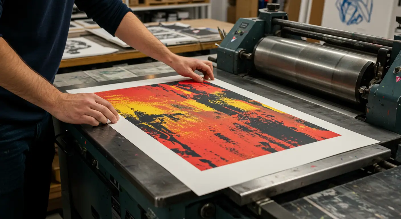
- Manual Techniques: Despite the dominance of digital tools, manual techniques still play an important role in expressive typography. Hand-drawing, Arabic calligraphy, and hand-printing (such as screen printing or letterpress printing) provide a unique texture and character that cannot be fully replicated by digital tools. These techniques allow designers to explore new dimensions of letters, adding an artistic and handmade touch that enhances the expressiveness of the design. Designers can start with hand-drawn sketches and layouts before moving on to digital execution, combining the best of both worlds.
- Modern Digital Tools: In addition to traditional software, several modern digital tools and techniques have emerged that enhance the capabilities of expressive typography. These tools include:
- Variable Fonts: These fonts allow designers to adjust multiple properties of the font (such as weight, width, slant) smoothly within a single font file, providing unprecedented flexibility in design.
- Augmented Reality (AR) and Virtual Reality (VR): These technologies allow letters to interact with the surrounding environment or to be displayed in three-dimensional spaces, creating immersive and interactive experiences for the audience.
- Artificial Intelligence (AI) and Machine Learning (ML): These technologies are used to develop tools that assist designers in creating new fonts, analyzing typography patterns, or even generating creative textual compositions based on specific criteria.
Tips for Mastering Expressive Typography

Mastering expressive typography requires a combination of theoretical knowledge, practical practice, and an artistic eye. Here are some tips that can help designers elevate their skills in this field:
- Fundamental Principles:
- Understand the Message: Before starting any design, it’s important to understand the core message that needs to be conveyed and the emotions that should be evoked. Is it a serious, playful, urgent, or calm message? This understanding will determine the choice of font, colors, and composition.
- Clarity First: Although expressive typography allows for letter manipulation, clarity should remain a priority. The text should be readable and understandable, even if it expresses something in a non-traditional way.
- Balance and Harmony: Even in bold designs, maintaining a kind of visual balance is necessary. Harmony among different elements (fonts, colors, spacing) ensures that the design looks cohesive and appealing.
- Continuous Experimentation: Don’t be afraid to try new and unconventional ideas. Expressive typography is a field for creativity, and experimentation is the key to discovering unique design solutions.
- Common Mistakes and How to Avoid Them:
- Overexpression: Excessive enthusiasm can lead to using too many effects or multiple fonts, making the design chaotic and difficult to read. The golden rule is often “less is more.”
- Ignoring Context: The design should fit the context in which it will be displayed. What works for a music poster might not work for an annual corporate report.
- Neglecting Details: Precise spacing between letters and words, consistency in sizes—all these small details make a big difference in the quality of the final design.
- Continuous Skill Development:
- Study the Works of Others: Draw inspiration from the works of famous designers in the field of expressive typography. Analyze their choices and how they use different elements to convey their messages.
- Regular Practice: Design is a skill that develops with practice. Set aside time for experimenting on personal projects, even if they are simple.
- Learn the Art of Arabic Calligraphy: Arabic calligraphy is a rich source of inspiration in expressive typography, combining artistic beauty with the deep expressiveness of letters. Studying this art can open new horizons for understanding how to manipulate letters to create stunning visual effects.
- Stay Updated on New Techniques: The design world is constantly evolving. Follow the latest software, tools, and trends in expressive typography to stay at the forefront of this exciting field.
Conclusion

In conclusion, expressive typography is more than just a design technique; it is a philosophy that gives letters a voice and personality. It is the art that transforms text from mere information into a visual and emotional experience. Through a deep understanding of its elements and applications, designers can make letters true heroes in their works, capable of delivering messages powerfully, evoking emotions, and leaving a lasting impression in the minds of the audience. In a world increasingly reliant on visual communication, expressive typography will remain an indispensable tool for designers seeking to transcend the ordinary and create truly speaking works of art.
“`
Note: Replace the `src` attributes in the `` tags with actual URLs to relevant images.
 العربية
