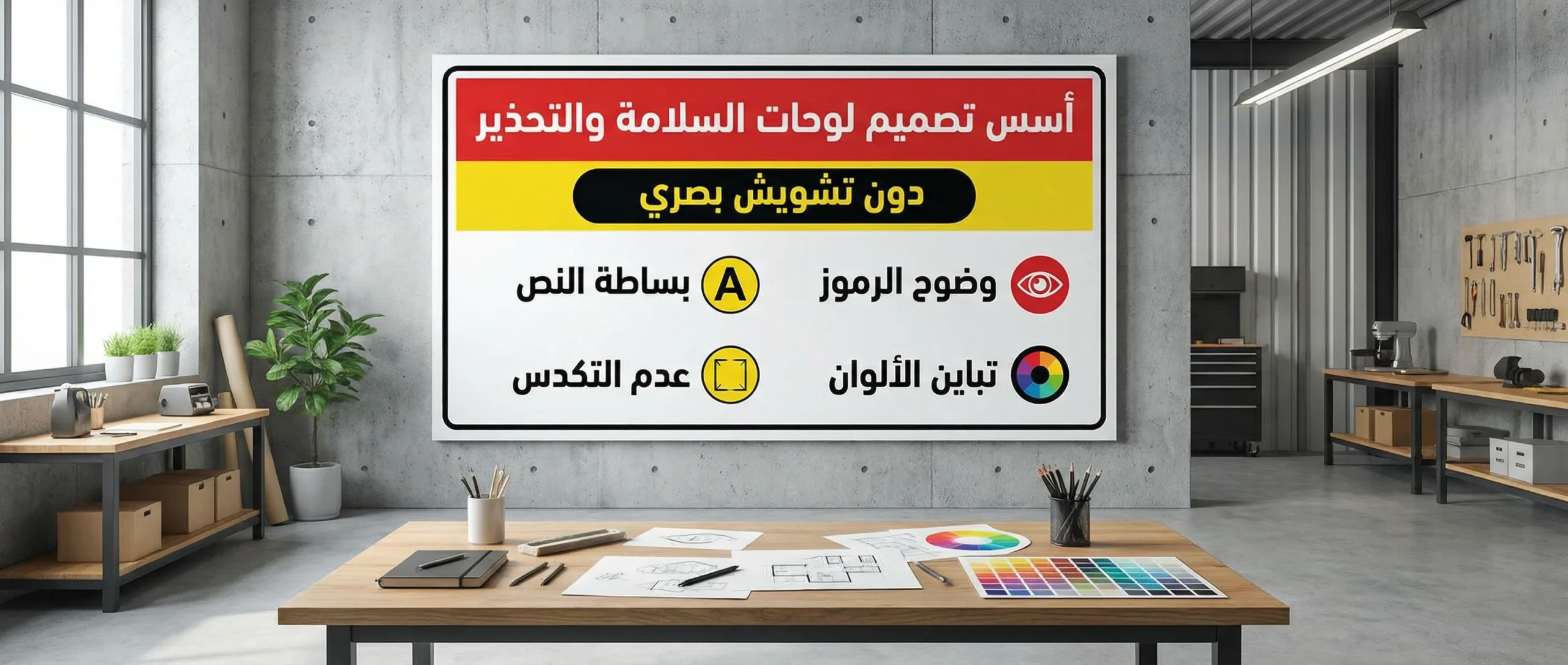
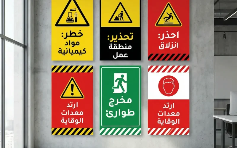
In any workplace or service facility, Safety and Warning Signs are the first line of defense before accidents happen. The real challenge is not simply “putting up a sign,” but designing a visual message that is understood in seconds, seen from an appropriate distance, read without strain, and prompts the right behavior without causing visual clutter or confusion.
The Importance of Safety and Warning Signs in Work Environments

Warning signs are not decorative elements; they are a risk-management tool. When used effectively, they deliver measurable benefits: fewer injuries, stronger compliance with procedures, faster emergency response, and clearer responsibilities on site. They also reflect the facility’s professionalism and support compliance with internal safety requirements and regulatory expectations.
Contrary to what some believe, the issue is usually not a lack of signs, but rather unorganized overuse, poor clarity, overly long wording, or color and type choices that reduce readability. The result is that people ignore the message due to “visual fatigue,” instead of the sign acting as a lifesaver.
Principles for Designing Safety and Warning Signs Without Visual Noise

For Safety and Warning Signs to grab attention quickly without confusing people, focus on these practical fundamentals:
1) Define the Goal and the Required Behavior Precisely
Before designing, ask: What action do I want the person to take right now? (Stop, wear a helmet, no smoking, electrical hazard…). The more specific the goal, the shorter and clearer the message becomes.
2) Make the Visual Hierarchy Obvious
The eye notices larger, higher-contrast elements first. Organize the content in layers:
- Message type indicator (Danger/Warning/Prohibition/Mandatory/Guidance)
- Symbol (a globally understood icon)
- Short headline (two to four words)
- Optional detail (only one line when needed)
3) Color Is for Classification, Not Decoration
Color should communicate the “type of hazard,” not beautify the sign. Maintain strong contrast between background and text, and avoid random mixing of colors within one sign. Most importantly, don’t rely on color alone; use both an icon and text because some people have difficulty distinguishing colors.
4) Symbols and Icons: Less Text, More Understanding
A good symbol can replace a full sentence. Choose common, easy-to-understand icons, and avoid complex illustrations or tiny details that disappear from a distance. Make the icon large enough to be understood as an “idea” before reading the text.
5) Typography: Clarity Above Everything
Select a clean, simple typeface and avoid decorative styling or excessive bolding/italics. The golden rule: if someone must move much closer to understand it, the design failed. Use proper spacing between letters and words, and don’t cram long text into a tight area.
6) White Space Is Part of the Design
Overcrowding tires the eye and weakens the message. Leave sufficient margins around text and icons, and create visual “breathing room” that supports fast reading.
7) Language and Wording: Short Commands Without Ambiguity
Use direct phrasing such as: “Electrical Hazard,” “Wear Safety Goggles,” “Keep Out.” Avoid long statements that start by explaining reasons. You want fast action, not a lecture.
8) Printing Materials and Finishes Affect Effectiveness
A visually strong sign can fail if it fades quickly, reflects glare, or peels in humid conditions. Choose materials that match the environment: indoor/outdoor, heat/humidity, chemicals, dust, and more.
9) Consistency Across the Site Reduces Confusion
When all signs follow the same rules (consistent colors per type, a unified font, similar sizes), workers understand messages faster and trust the system. Inconsistent styles create unconscious neglect.
- Practical example: when updating a work area or adding new equipment, don’t just add a new sign randomly. Review the full system so messages don’t repeat or contradict each other.
(Reference Table) How to Choose Color and Visual Tone in Safety and Warning Signs
| Message Type | Behavioral Goal | Design Tone | Practical Notes |
|---|---|---|---|
| High Danger | Immediate stop / move away | Strong and direct | Keep the headline extremely short and the icon large |
| Moderate Warning | Attention and caution | Clear without exaggeration | Add one explanatory line when needed |
| Prohibition | Do not perform an action | Decisive and simple | Use a clear prohibition symbol with a specific action |
| Mandatory | Perform a required action | Directive | Focus on the action (Wear/Use/Comply) |
| Guidance | Direction / information | Calm and clear | Make it easy to read from a distance |
Choosing Text and Icon Size by Viewing Distance

One of the most common reasons signs fail is a mismatch between size and installation location. There is no value in an excellent sign if it cannot be read from the natural point of passage.
| Approx. Viewing Distance | Suitable Headline Size | Secondary Text Size | Design Recommendation |
|---|---|---|---|
| 1–3 meters | Large | Medium | Prioritize headline and icon; minimize details |
| 3–7 meters | Very large | Medium | Increase contrast and reduce word count |
| 7–15 meters | Huge | Very little | Make the message 1–2 words with a clear icon |
Note: These are general guidelines and may need adjustment based on lighting, walking speed, and viewing angle.
Sign Materials: A Creative and Operational Decision
| Environment | Common Material | Why It Fits | Warning |
|---|---|---|---|
| Indoor offices | PVC / Foam board | Lightweight and cost-effective | Avoid high gloss under strong lighting |
| Factories / workshops | Aluminum / coated metal | Resists impact and heat | Choose scratch-resistant coating |
| Outdoor | Aluminum + UV-resistant print | Longer life under sun exposure | Ensure water and fade resistance |
| Chemical areas | Corrosion-resistant materials | Withstands fumes and substances | Verify material compatibility with the chemicals present |
Where Should the Sign Be Placed? Location Is Half the Message
Even the best design weakens if it is installed in the wrong place. Consider the following:
- Place the sign before the hazard point at a distance that allows a natural reaction.
- Avoid placing it behind doors or columns, or above/below an uncomfortable viewing level.
- Don’t cluster ten signs in one small area; distribute them across key decision points.
- Consider traffic direction: a sign on the right side of the path is often read more easily in many environments.
- In crowded areas, use an ultra-short sign and route details elsewhere if needed.
Testing Effectiveness Before Approving Safety and Warning Signs
Don’t approve a sign just because it “looks nice.” Test it as a communication tool:
- 3-second test: Show the sign to someone who has never seen it and ask: What is the message? What action is required?
- Distance test: Can it be read from the natural point of passage?
- Lighting test: Try it in daylight and at night if outdoors, or under strong workshop lighting.
- Context test: Place it beside real environmental elements (wall colors, visual noise, equipment).
- Consistency test: Does it conflict with a nearby sign? Are messages duplicated?
These quick tests prevent costly mistakes and increase compliance because workers feel the message is “made for them,” not just a formality.
Common Mistakes in Safety and Warning Signs and How to Avoid Them
- Overly long text: Solution: keep it a short phrase + icon; put details in training/guidelines.
- Weak contrast: Solution: use a clear background with dark text (or the reverse); avoid gray-on-gray.
- Unclear symbols: Solution: use common icons and confirm they remain clear from a distance.
- Unjustified style variation: Solution: apply a unified system for colors, typography, and sizes across the site.
- Too many signs in one spot: Solution: place one decisive sign at the decision point, and distribute the rest.
- Ignoring material selection: Solution: choose materials that match heat, humidity, sunlight, and chemicals.
- Poor translation or complex terminology: Solution: use clear, simple language without confusing abbreviations.
Practical Steps to Design a Successful Sign the First Time
- Gather hazard details and required behavior from the safety team or on-site supervisor.
- Write a headline of no more than four words.
- Choose a clear icon and test it at a large size.
- Assign a category color (Danger/Warning/Prohibition/Mandatory/Guidance) and keep it consistent across signs.
- Create a first draft and apply the 3-second test.
- Revise, then print a small sample to test glare, lighting, and material behavior.
- Approve the final version and keep a unified template for future updates.
Conclusion
An effective sign is not the one filled with the most information, but the one that delivers a single decision quickly: “What should I do now?” When Safety and Warning Signs are designed with clarity, contrast, visual hierarchy, and correct placement, they become part of daily safety culture—not just wall décor. Invest in a unified system and simple pre-approval tests, and you’ll notice an immediate improvement in compliance and risk reduction.
 العربية
