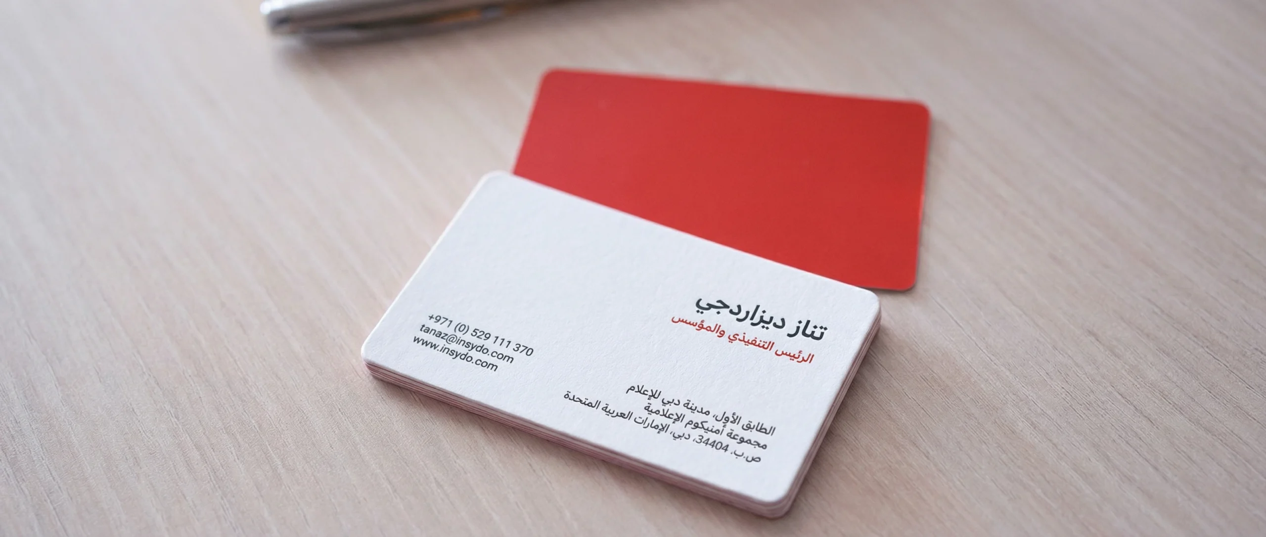
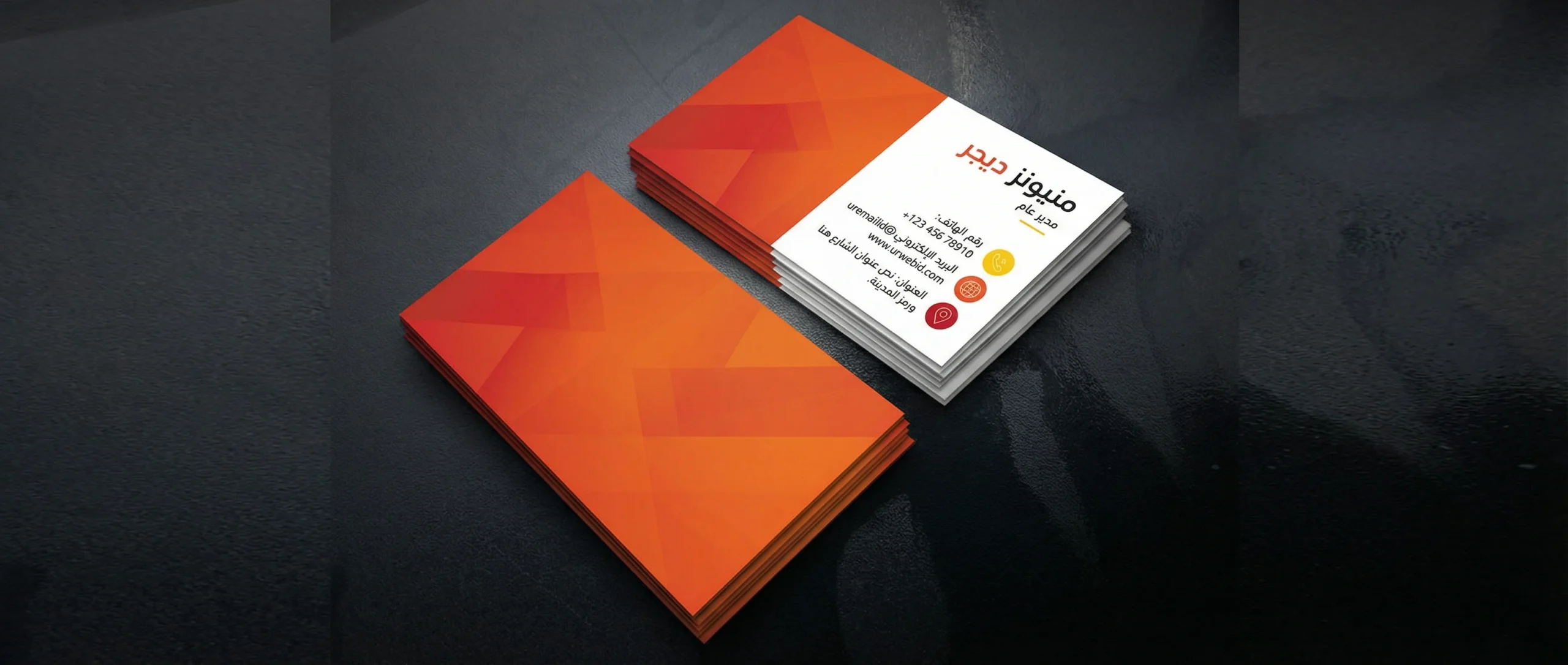
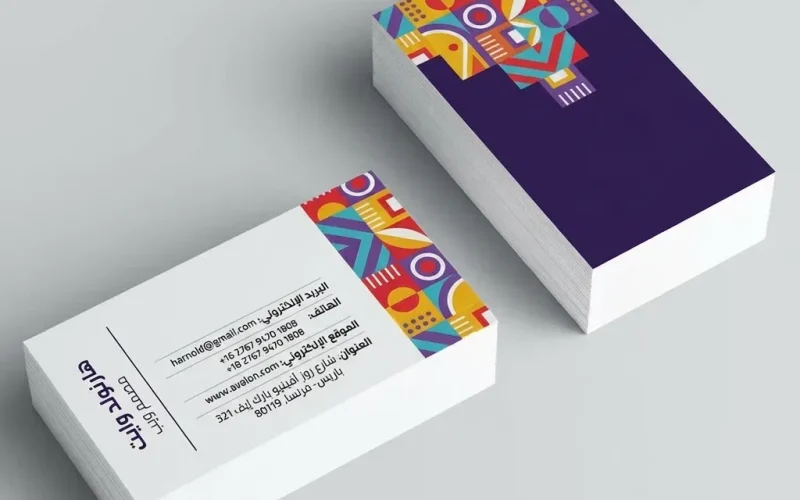
In a market crowded with options, a business card is not just an identification slip; it is a fast “touchpoint” that captures the first impression and reinforces your professionalism. When Business Card Design is executed in harmony with your visual identity, every detail—from color to typography to whitespace—becomes a unified message that tells the client: this is a brand that knows itself and understands its audience.
This article provides a practical framework for aligning your business card with your brand identity. It explains how to choose the right elements, how to avoid mistakes that weaken trust, and how to produce an outcome that is print-ready and effective for sales, exhibitions, and meetings.
Why does business card design succeed when it starts from the brand identity?

Visual identity is not “decoration”; it is an integrated visual system that defines how your brand is seen and remembered. A business card is often the first tangible piece a client receives, so any mismatch between the card and your other materials (website, social media, presentation deck, uniform, etc.) creates confusion and reduces the sense of consistency. Alignment with the identity delivers four direct benefits:
- Building trust through consistency.
- Improving recall because elements repeat intelligently.
- Speeding up the decision to contact you because information is organized and visually clear.
- Reducing future redesign costs because you work within a stable system of design.
Visual identity components that must be reflected on the card

Even if you only have a brief “brand guide,” make sure the following elements appear in a disciplined way on the card:
- Logo: fixed placement, clear space (safe zone), and correct color usage.
- Color palette: one primary color with one or two supporting colors, plus well-calculated shades.
- Typography: a heading font and a small-text font, with readable sizes.
- Visual style: are you minimal, premium, technical, medical? This defines the visual rhythm.
- Icons and symbols: one consistent style—do not mix different icon “schools.”
- Grid and spacing rules: to ensure balance and precise alignment.
A practical methodology for Business Card Design step by step

Professional work starts with the “goal,” then moves to “content,” then “design,” then “printing.” Follow these steps:
- Define the card’s goal: networking, direct sales, support contact, partnerships, etc.
- Choose the card type: one-sided, two-sided, or a
business card
with a QR code that leads to a profile. - Prioritize information: name, title, primary contact method, then the rest.
- Create a rough layout before diving into colors and decoration.
- Apply identity rules: colors, fonts, icon style, and spacing.
- Prepare a print version and a digital version with the same consistency.
Because the goal drives decisions, review this point carefully:
- The goal of Business Card Design is not “filling space,” but delivering information with maximum clarity and minimal visual noise.
Table: content priority by business type
| Business type | What to highlight | What to minimize | Practical note |
|---|---|---|---|
| Professional services (legal/consulting) | Name, title, website, official email | Too many social links | One strong color + premium paper builds trust |
| Store / retail | Phone number, store location, WhatsApp | Long addresses | Add a QR code to the catalog or website |
| Tech / software | Email, LinkedIn, portfolio | Random icons | Minimal style with high contrast |
| Medical / clinics | Specialty, address, booking hours | Too many sub-logos | Avoid ultra-thin fonts |
Design rules that ensure clarity and elegance
- Contrast before beauty: ensure text remains readable even in low light.
- Whitespace is a design element: give breathing room around the logo and key information.
- Do not mix fonts: two fonts max preserves identity and reduces clutter.
- Alignment matters more than decoration: it instantly signals professionalism.
- Use appropriate font sizes: avoid extremely small sizes for fine details.
- Make the back serve the goal: it can include a QR code, a short tagline, or your core services.
This is where Business Card Design becomes a practical translation of your identity: if your brand is “calm and refined,” the card should breathe calmly; if it is “bold and energetic,” a strong primary color can lead the composition without exaggeration.
The most common mistakes—and how to avoid them
- Information overload: too many numbers and links undermines the card’s core purpose.
- Colors that do not match the identity: even a one-shade difference can break consistency.
- Ignoring margins and trimming: what looks good on-screen may get cut incorrectly in print.
- Mixing multiple icon styles: it creates an unprofessional feel.
- Untested QR code: a code that does not work instantly weakens trust.
What should you put on a business card? The “less, but clearer” rule
The toughest decision is often not the look, but the content. Many companies add everything thinking it increases opportunities, but the result is a confusing card. The practical rule: include information that lets the client contact you within seconds, and leave extra details for a digital page (a website or profile).
Core content recommended for most businesses
- Your full name as you want to be addressed.
- Your job title or specialty in a clear, understandable phrasing.
- One primary phone number (preferably connected to WhatsApp if your audience uses it).
- An official email address.
- City/location or a short address if you serve clients in person.
Optional content (case-by-case)
- A LinkedIn or portfolio link (for professional and technical services).
- A QR code leading to “About us” or “Book an appointment.”
- One social account if it is the primary sales channel.
Content best avoided
- More than one phone number without a clear reason.
- Very long addresses or a paragraph-style description.
- Multiple social links for inactive accounts.
Front and back: smart role distribution
Think of the card as two spaces, each with a role:
- Front: quick identification and a strong identity (logo + name + title).
- Back: a call to action (QR for booking/website) or a brief list of services.
This distribution increases clarity and reduces the chance that “the client reads but doesn’t know where to go.”
Table: tagline examples by brand tone
| Brand tone | Example tagline (one line) | Fits |
|---|---|---|
| Formal and trustworthy | Consulting solutions that help you make more accurate decisions | Consulting, legal, finance |
| Friendly and service-oriented | We help you choose the best… and deliver fast | General services, maintenance, education |
| Technical and direct | We build scalable digital products | Software, tech companies |
| Luxury / premium | A refined experience starts with the details | Hospitality, luxury real estate, fragrances |
Printing and finishing standards that elevate Business Card Design
Choosing paper and finishing is not only an aesthetic decision; it is a “experience” decision. Clients remember the feel of the card as much as they remember the look. Here is a practical comparison to guide your choice:
| Paper / finishing option | Impression | Suitable for | Cost note |
|---|---|---|---|
| Matte | Calm and premium | Consulting, legal, real estate | Medium |
| Glossy | Vibrant with color shine | Retail, events | Low to medium |
| Velvet (soft-touch) | High-end luxury | Premium brands | Above average |
| Spot highlighting (selective emphasis) | Focus on logo/name | Most sectors | May increase depending on coverage |
| Foil stamping | Obvious luxury | Hospitality, luxury | High |
Simple technical printing guidelines
- Choose a common standard size in your market so it fits wallets easily.
- Maintain an internal “safe area” for text so it does not approach the edges.
- Verify logo quality and text clarity before sending to print.
- Print a sample before a large quantity if your identity is color-sensitive.
Practical examples: applying identity by sector
In tech companies, card success often comes from simplicity: one primary color, clear typography, and a QR code leading to a short profile page. In healthcare, calmer colors and clear specialty/address information work best. In commerce, the priority may be the fastest contact channel—such as WhatsApp or a phone number—paired with a distinctive visual element that anchors the identity.
At this point, you will notice that Business Card Design is not a one-size-fits-all template; it is a balancing act between identity rules, sector requirements, and customer behavior.
Checklist before approving the final file
Review these points quickly before sending your design to print:
- Is the logo clear and not touching the edges?
- Do the colors match what you use on your website and marketing materials?
- Is the font readable at small sizes?
- Is the primary contact information the most prominent?
- Has the QR code been tested on more than one phone?
- Does the print file include correct bleed and trim settings?
- Does Business Card Design achieve its core goal within 3 seconds of viewing?
Suggested timeline for delivering a polished card
| Stage | Expected duration | Output | Quality note |
|---|---|---|---|
| Define goals and gather brand assets | 1 day | Creative brief | The clearer it is, the fewer revisions you need |
| Organize and finalize content | 0.5 day | Final copy | Avoid long text blocks |
| Initial layout and composition | 0.5–1 day | One or two drafts | Do not start with colors before layout |
| Execute the final design | 1–2 days | Final file | Follow the brand guide precisely |
| Review + QR test + data proofing | 0.5 day | Approved version | Proofing reduces costly errors |
| Print a sample then approve quantity | 1–3 days | Printed sample | Important for special finishes |
How do you measure the card’s success after distribution?
Even a business card’s impact can be measured. Try simple indicators:
- Number of calls/messages within two weeks of an event or exhibition.
- Number of visits to the QR landing page (if it leads to a dedicated page).
- Repeated customer questions: do they decrease because the card clarified the service?
- Retention rate: ask a few clients whether they still have the card after some time.
Summary
When a card is built on your visual identity and executed with a balance between clarity and beauty, it becomes an effective part of your marketing system—not merely an identification slip. Your commitment to consistency, information hierarchy, and an appropriate finish makes Business Card Design a practical tool that supports sales and strengthens trust in your brand.
 العربية
