 العربية


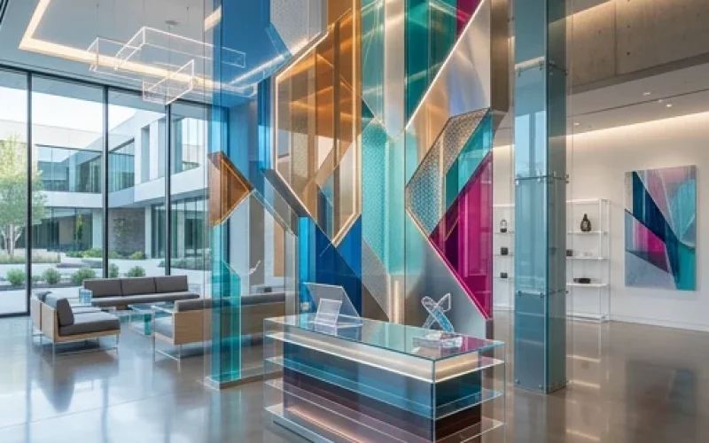
In 2026, acrylic signs are no longer just a way to display a store name or identify a visitor inside an office. They have become a direct part of the brand experience, the first impression, and the way customers are guided within a space. That is why acrylic sign design has become more closely connected to visual identity, readability, lighting quality, and the final execution finish, rather than relying only on the traditional glossy look. The latest creative trends point to the rise of immersive visual experiences, authentic design, and carefully layered color palettes, while modern commercial signage guidelines emphasize that clarity, contrast, concise messaging, and strong visibility in real spaces have become decisive elements in the success of any sign.
Why Is Acrylic Sign Design Evolving So Quickly in 2026?
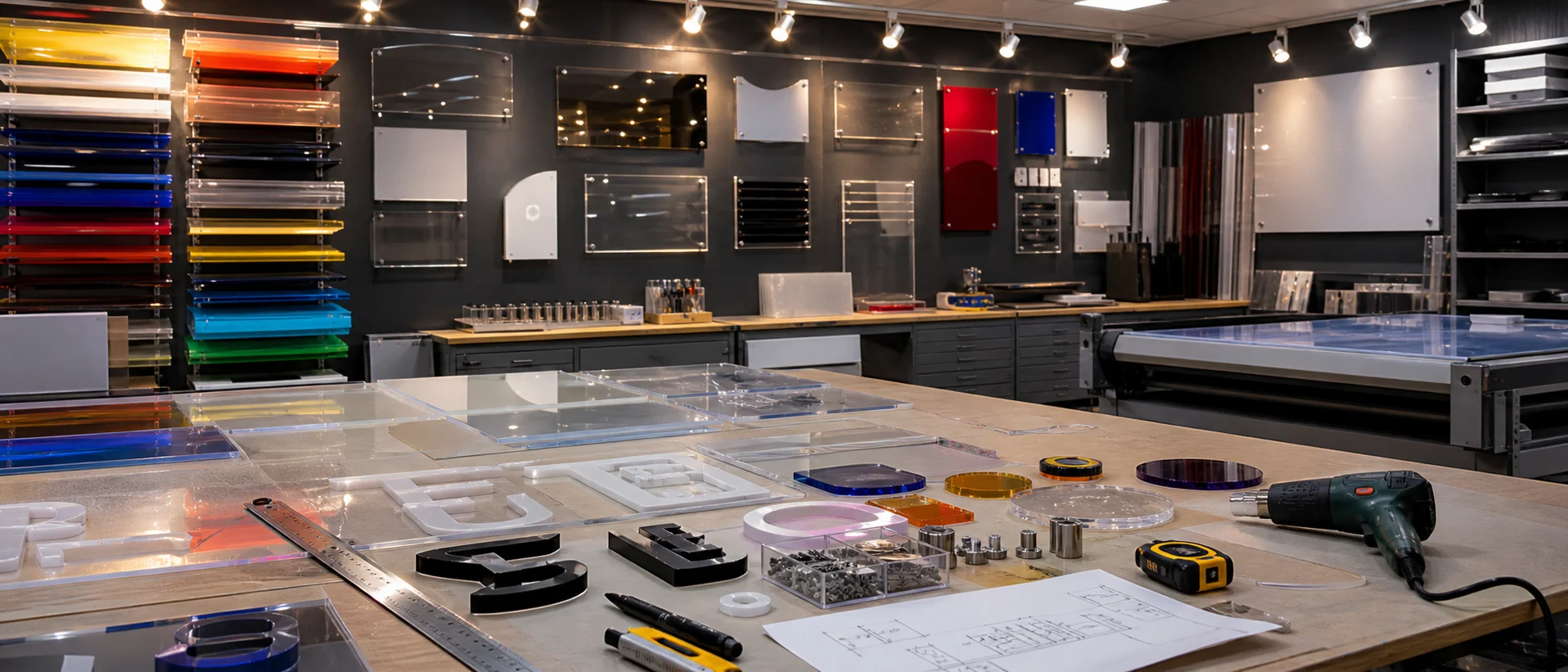
The first reason is the change in customer expectations. Today’s audience does not simply want an “acceptable” sign; they want an execution that reflects the professionalism of the place from the very first glance. Acrylic is already a highly demanded material because it is transparent, durable, and offers a glass-like appearance with greater flexibility for both indoor and outdoor uses. This is why it is widely used in reception signs, directional signs, architectural identity, offices, clinics, exhibitions, and events.
From a market perspective, the success of a sign is no longer linked to appearance alone, but to its ability to perform a dual function: attracting attention quickly and then communicating the message clearly. That is why, in 2026, we see an increasing focus on concise visual layouts, white space, clear typography, and thoughtfully finished materials, instead of text-heavy layouts or excessive decoration. This shift does not only make the sign more beautiful; it also makes it easier to understand and remember.
The first clear trend this year is high-impact minimal design. Minimalism here does not mean emptiness or weakness. It means that every element has a purpose: the brand name, the logo, the arrow, or the identifying message. When spacing is balanced and elements are fewer, the focus on the core message becomes stronger. This is especially important in acrylic signs because the material’s gloss and transparency can become distracting if the composition is crowded. In 2026, the best approach is to combine a clean background, precise alignment, clear typography, and strong visual contrast that ensures quick readability from a suitable distance.
The second trend is visual depth and raised letters. Many modern projects are moving toward three-dimensional letters or multiple layers over the acrylic surface because depth adds a stronger architectural presence than flat printing alone. This is especially suitable for premium offices, lobbies, interior façades, and reception areas that need a luxurious appearance without exaggeration. What is notable is that this depth does not depend only on the thickness of the panel, but also on the installation method, the distance from the wall, and the calculated empty space around the letters or logo.
The Most Prominent Colors in Acrylic Sign Design This Year
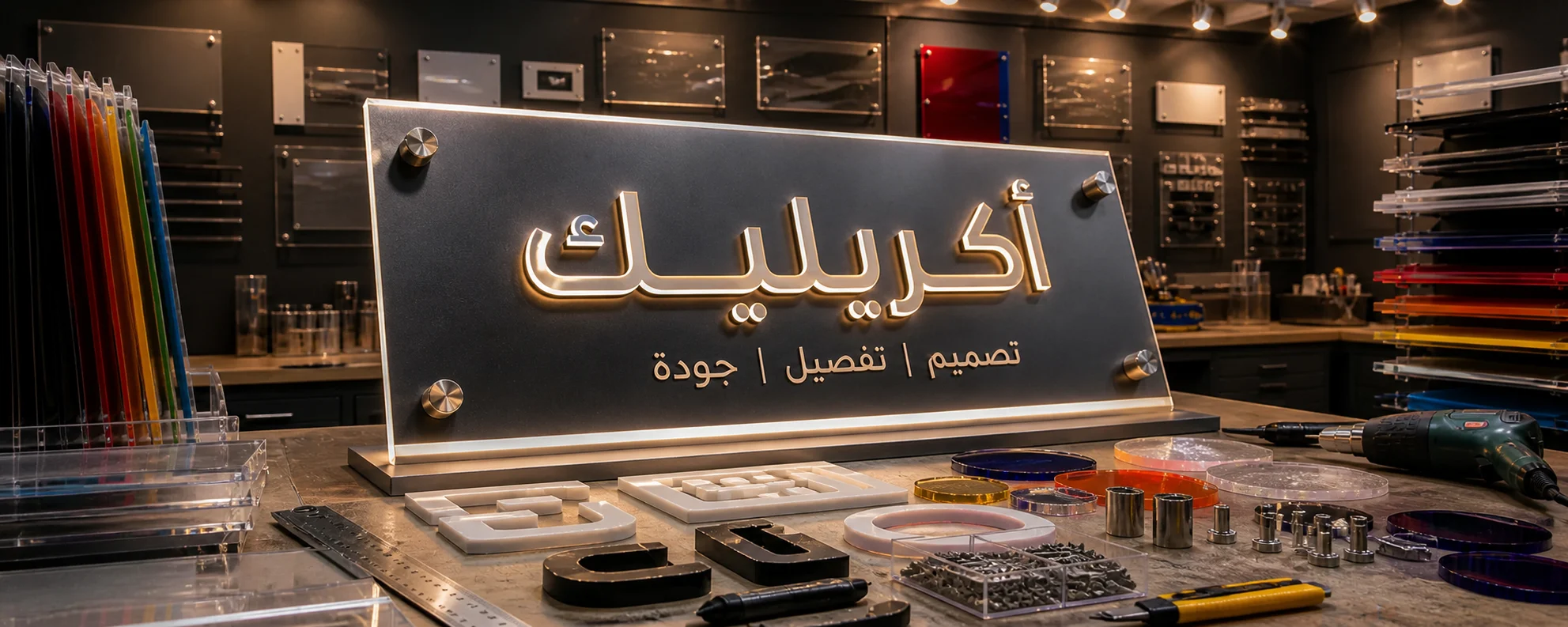
In terms of color, 2026 trends lean toward a smart mix of warm calm tones and bold saturated accents. Color and design reports for this year indicate the continued presence of sophisticated color families that combine comfort with distinction, with a clear move toward colors that create a human and authentic impression rather than one that feels cold or mechanical. In practice, this means that warm beige, soft gray, ivory, and semi-matte surfaces work well as a base; then a stronger accent, such as deep blue, burnt orange, saturated green, or a limited use of red, can be added to highlight the logo or main title.
This trend is especially important in modern Arab spaces, where many brands seek quiet luxury instead of visual noise. Since acrylic naturally reflects light and displays edges attractively, neutral colors with a focused color accent give the sign a clearer sense of elegance than using too many colors in a small space. If the project is for a clinic, consulting office, or technology company, calm colors with strong typography often create a more confident and professional result than visually loud solutions.
Smart Lighting in Acrylic Sign Design
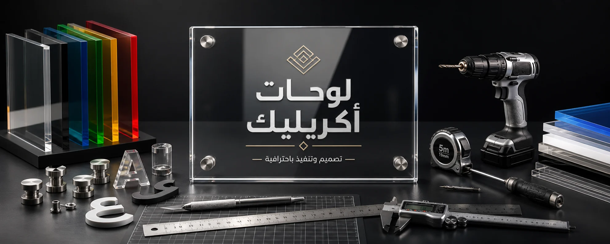
Lighting is not a secondary addition in 2026; it is a core design element. The most prominent options this year are backlighting, halo lighting effects, and illuminated letters with a strong nighttime presence. These options give the sign continuous visibility throughout the day, increase brand presence in crowded places, and add a refined visual dimension inside offices, exhibitions, and façades. Specialized sources in the signage industry also show that backlit or LED-lit letters improve visibility and create a modern, balanced appearance, especially when installed with a calculated gap from the wall.
The most important advantage here is that modern lighting no longer means excessive visual consumption or high energy use. Long-life, energy-efficient LED lighting makes the sign more sustainable and requires less maintenance compared with older solutions. Combining acrylic with aluminum in illuminated letters or light boxes also opens a wide range of customization possibilities, whether the goal is an outdoor façade that attracts attention or an elegant indoor logo in a reception area.
How Printing and Cutting Support Acrylic Sign Design
Another important practical trend in 2026 is the shift from the traditional rectangular sign to custom shapes, polished edges, and semi-matte or anti-reflective finishes, depending on the installation location. Contemporary acrylic is not used only as a printed surface, but as a visual element in itself. It can be cut according to the shape of the logo, enhanced with outer borders, finished with polished edges that give the sign a luxurious shine, or produced with a less reflective surface when readability is more important than gloss. The thickness of the panel and the installation method using metal standoffs also have a major impact on the final result.
The key point here is that successful execution is not based on appearance alone, but on matching the finish to the purpose. A reception sign in a law firm, for example, may benefit from a polished edge, metal standoffs, and an elegant transparent touch. Meanwhile, a directional sign inside a medical complex needs clearer typography, less reflection, stronger contrast, and symbols that can be understood quickly. Modern wayfinding signage guides indicate that readability, clear fonts, suitable sizes, and visually comfortable surfaces all make user movement inside a place smoother and easier.
When planning any acrylic sign design project, it is useful to summarize the trends in a practical table that helps support faster decision-making:
| Trend | What Does It Mean in Practice? | Where Does It Work Best? |
|---|---|---|
| High-clarity minimalism | Less text, higher contrast, and more white space | Offices, clinics, and premium stores |
| Raised letters or layered elements | Visual depth and stronger architectural presence | Lobbies, reception areas, and façades |
| Backlighting and halo lighting | Better visibility and a modern look day and night | Façades and interior logos |
| Warm colors with saturated accents | A balance between calmness and distinction | Luxury and modern brands |
| Custom finishes | Polished or matte edges and logo-based shapes | Projects that need a unique identity |
| Wayfinding and readability | Clear symbols, suitable fonts, and less glare | Medical, commercial, and educational complexes |
| More sustainable execution | Energy-saving LED, longer lifespan, and better recyclability | Long-term projects |
This table summarizes what is supported by creative trend reports, commercial signage clarity guidelines, modern acrylic uses, and lighting technologies for raised letters in today’s market.
From an execution perspective, there is a big difference between a beautiful idea on screen and a successful real-world project. Before approving the sign, it is better to evaluate the following elements:
| Decision Element | Best Option for a Luxury Look | Best Option for Practical Clarity |
|---|---|---|
| Surface type | Transparent or semi-transparent with polished edges | Matte or less reflective |
| Message style | Short name and clear logo | Direct guidance and easy symbols |
| Lighting | Backlighting or halo lighting | Balanced lighting without glare |
| Installation | Metal standoffs with space from the wall | Direct installation if the use is functional |
| Color | Elegant neutral base with an accent color | High contrast between background and text |
To turn these trends into a real result, it is useful to follow a short practical checklist:
- Define the main purpose of the sign: identification, wayfinding, or brand enhancement.
- Study the distance from which the message will be read.
- Choose the material, thickness, and finish based on the installation location.
- Review the brand identity before starting acrylic sign design to ensure consistency in fonts and colors.
- Test the actual lighting of the space before final approval.
- Reduce the number of words to the level that ensures fast understanding.
Mistakes to Avoid in Acrylic Sign Design
The most common mistake is believing that luxury means adding more elements. In reality, using too many fonts, combining several visual effects in a small space, or applying many colors on a glossy surface are all decisions that weaken the message. The second mistake is ignoring the installation environment. There is a major difference between a sign viewed in a narrow corridor under ceiling lighting, a sign viewed from the street, and a sign used inside a calm reception area. The third mistake is choosing a finish that looks beautiful visually but is not suitable for reading because of reflection, small font size, or weak contrast. These points appear repeatedly in commercial signage and user wayfinding guidelines.
Another equally important mistake is ignoring operational sustainability. A modern sign is not a one-day project; it is a visual asset that should serve for years. That is why it is smarter to think about the operating life of the lighting, ease of maintenance, the ability to update the message, and even recyclability when replacement becomes necessary. Some acrylic suppliers clearly highlight the recyclability of acrylic signs, while modern LED systems offer better lifespan and higher efficiency than traditional lighting solutions. This does not only benefit the environment; it also reduces long-term costs.
Frequently Asked Questions
Is acrylic suitable only for indoor spaces?
No. Acrylic is commonly used indoors and outdoors, especially in lobby signs, directional signs, entrances, and some façades, provided that the right thickness, installation method, and finish are selected for each environment.
Which option is more popular today: flat printing or raised letters?
If the goal is a premium appearance and stronger presence, raised letters with backlighting are clearly leading in 2026. However, if the goal is fast informational communication and a more controlled execution budget, direct printing with strong contrast can be an excellent option.
What are the best colors for modern Arab projects?
The best approach is usually a calm neutral base with a carefully chosen accent color that reflects the brand personality. This balance aligns with 2026 trends, which lean toward warmth, authenticity, and quiet distinction instead of color chaos.