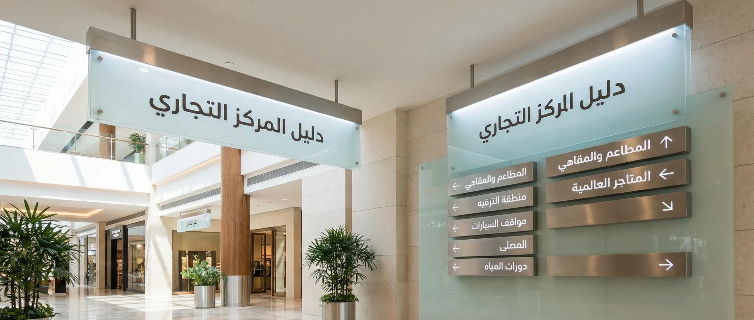
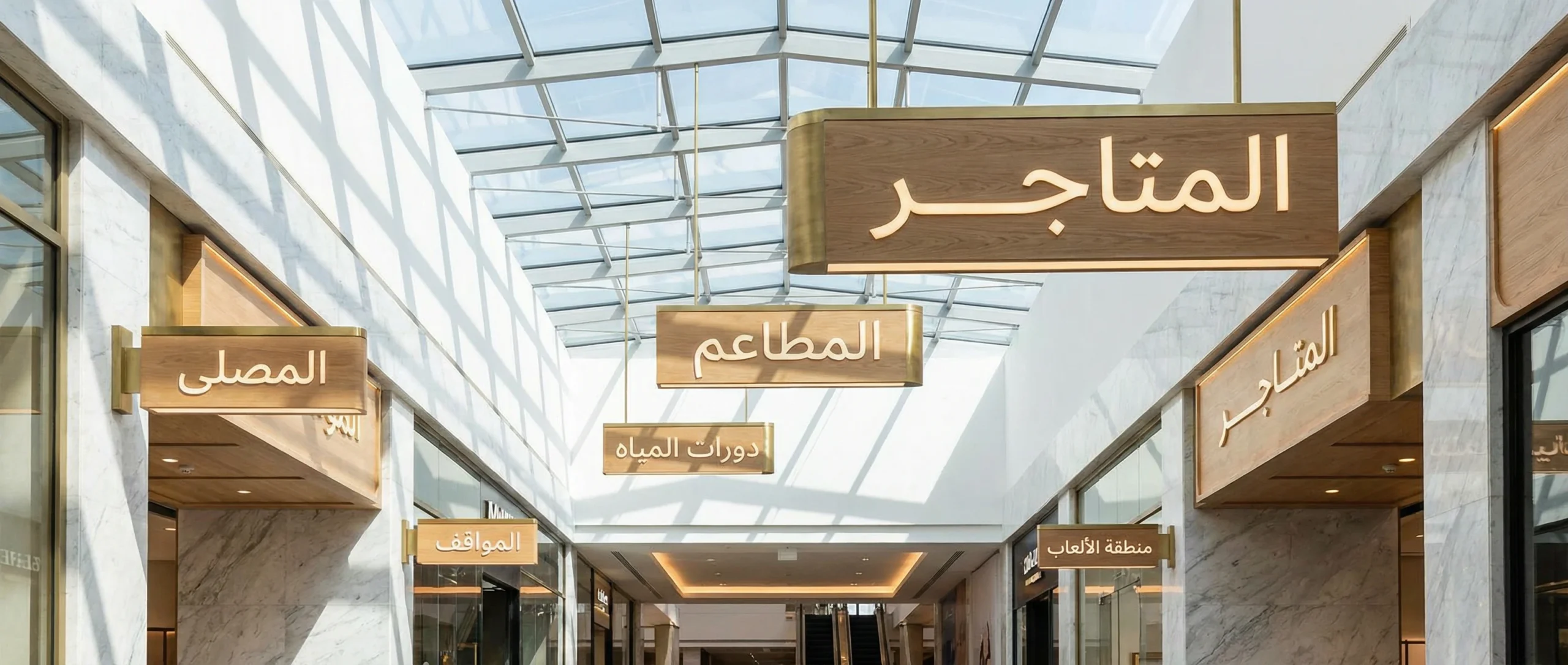
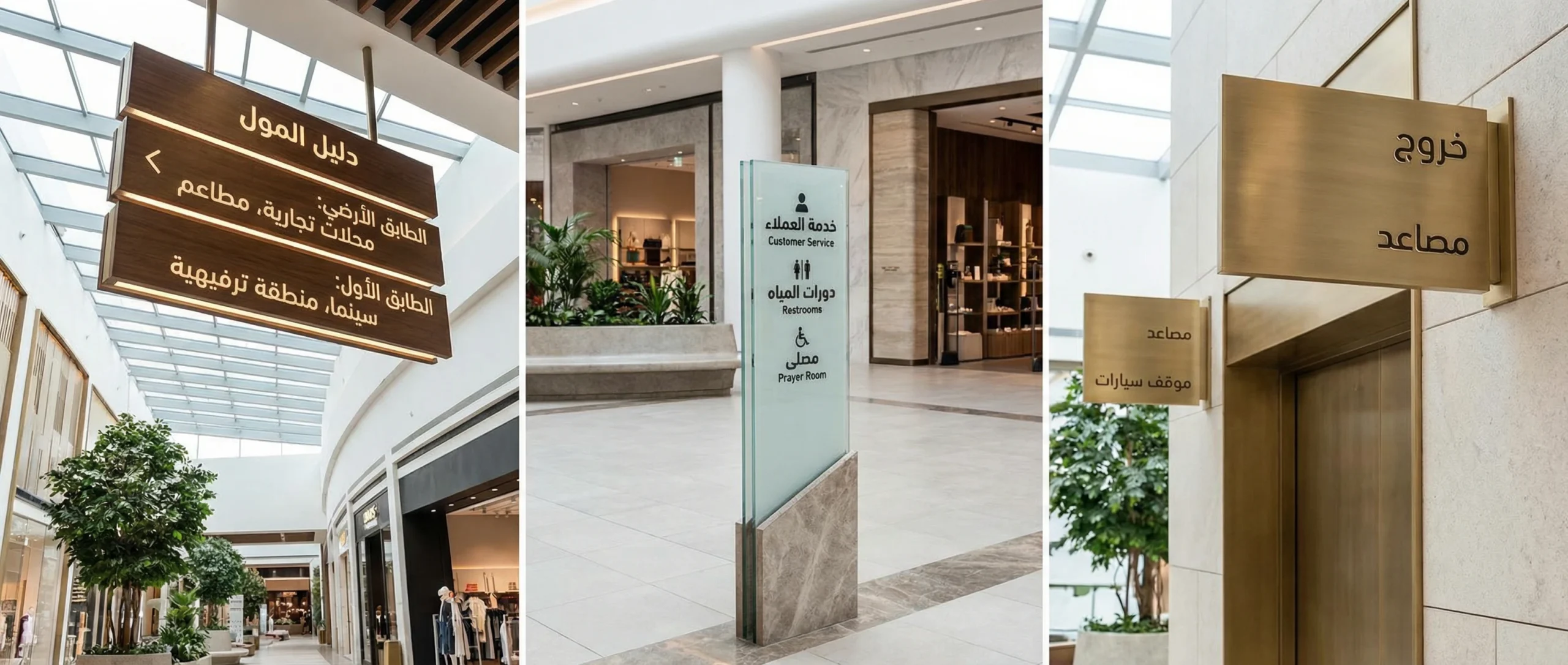
In modern malls, the visitor experience doesn’t start at a storefront or end at the checkout counter. It takes shape from the moment a guest enters through the gate until they reach the nearest facility, store, or exit. That’s where wayfinding signs play a dual role—operational and marketing at the same time: they reduce confusion, shorten search time, improve service quality, and directly influence overall impressions and loyalty.
A shopping center with a clear navigation system gains more than just “visitor comfort.” It reduces pressure on customer service, drives foot traffic toward less-visited areas, and minimizes complaints related to parking, elevators, and restrooms. Most importantly, it makes the space feel more organized and professional—raising the perceived value for tenant brands and improving return-visit rates.
Why are wayfinding signs essential for mall operations?

There are four direct operational benefits you can’t ignore:
- Reducing repeated inquiries: When visitors can find their way easily, they rely less on information desks and security staff.
- Improving flow and reducing congestion: Correct guidance distributes movement instead of creating bottlenecks at key nodes (elevators, escalators, parking gates).
- Enhancing safety and compliance: Clearly marking emergency exits, assembly points, and accessible routes is not a “nice-to-have.”
- Boosting commercial performance: Spreading visitors across floors and corridors increases store discovery and improves dwell time inside the center.
From an SEO/content marketing perspective, many malls talk about “visitor experience” in general terms. But detailing practical operational elements—like internal navigation—makes the content more credible because it reflects real day-to-day operations.
Types of wayfinding signs in shopping centers and how to choose the right one

Choosing the type isn’t about “looks” alone. It depends on placement, traffic density, and how information is read from a specific distance and angle. The most common types include:
- Corridor direction signs: Guide visitors to store names or zones (food court, cinema, games).
- General directory signs: Floor and store maps, usually placed near entrances and major transition points.
- Facilities and services signs: Restrooms, prayer room, first aid, mother & baby room.
- Parking and entrance signs: Parking numbering, zone color/letter coding, and quickest access to the nearest elevator.
- Safety and emergency signs: Exits, fire extinguishers, evacuation routes, and assembly points.
- Internal identity signs: Naming floors and areas (Ground Floor, Mezzanine, Halls…), and standardizing language, icons, and style.
To avoid ending up with “many shapes and no system,” follow a simple rule: each sign must answer one clear question at one specific moment in the visitor journey.
Design standards that ensure readability and fast comprehension

Effective design here is not freeform art—it’s a set of measurable standards:
- Distance readability: Font size, weight, and sufficient whitespace around text.
- Color contrast: Text must remain clear in both bright and dim lighting, including reflections.
- Information hierarchy: Direction first, then destination, then details (such as store number or arrow).
- Standard icons: Global symbols for facilities reduce language dependency.
- Languages: In many Arab-region malls, Arabic and English are expected—while keeping terminology consistent.
- Brand consistency: Fonts and colors should feel like an extension of the mall’s identity, not disconnected stickers.
To reduce mistakes, test each sign in the field before scaling. What looks clear on a designer’s screen can be completely different when mounted 3 meters high in a busy environment.
Manufacturing materials: durability, cost, and maintenance
Choosing a material isn’t only a visual decision—it determines operational lifespan and maintenance cost. The table below offers a quick comparison:
| Material | Pros | Cons | Best Use |
|---|---|---|---|
| Coated aluminum | Durable, rust-resistant, professional look | Relatively higher cost | Main corridors and entrances |
| Acrylic | Elegant appearance; supports backlighting | Can scratch if not protected | Signage for stores and internal identity |
| High-quality PVC | Cost-effective and lightweight | Less premium and shorter lifespan than metal | Temporary signs or low-traffic areas |
| Stainless steel | High-end feel and strong durability | High cost; fingerprints/cleaning needs | VIP areas or premium entrances |
| Vinyl on a rigid surface | Fast to install and easy to update | Affected by heat/scratches | Seasonal updates and promotions |
Spatial planning: where should signs be placed to truly work?
A great sign in the wrong place equals “zero value.” Spatial planning should follow visitor decision points:
- Entry point: Visitors need a quick map and a clear understanding of floor layout.
- Turning points: Corridor intersections, food court gateways, cinema entrances.
- Vertical nodes: Elevators, escalators, corridors leading to parking.
- Service points: Restrooms, prayer room, information desk, first aid.
To measure success, use simple performance indicators (even before advanced systems):
| Metric | How to Measure Practically | Realistic 60-Day Target |
|---|---|---|
| Information desk inquiry volume | Daily log of the top 10 repeated questions | Reduce by 20–35% |
| Time to reach a key facility | “Mystery shopper” tests from different starting points | Reduce by 15–25% |
| Parking/exit complaints | Track and categorize complaints | Reduce by 20% |
| Footfall balance between floors | Observation at peak times or simple counting | Gradual improvement based on design |
Universal access: accessibility is not optional
Any professional internal navigation system should account for:
- Readable height for wheelchair users at directory points.
- Strong color contrast for visitors with low vision.
- Clear icons instead of relying on long text.
- Marked routes to elevators and accessible facilities.
These details don’t only improve the experience—they also reduce operational risk and show respect for all visitors.
Content management and updates: the “fast-growing mall” problem
Malls are always changing: a store closes, another relocates, seasonal events, areas get restructured. That’s why any successful navigation system needs an update plan:
- A design approach that allows swapping store names without remanufacturing the entire sign.
- A logical numbering system for parking and stores that remains editable over time.
- An internal staff guide that defines naming standards and terminology (so one sign doesn’t contradict another).
- Quarterly reviews of content and the most confusing locations for visitors.
| Maintenance Item | Suggested Frequency | Owner | Operational Note |
|---|---|---|---|
| Clean corridor signs | Weekly | Cleaning/Operations | Reflections reduce readability |
| Check suspended sign fixings | Monthly | Maintenance | Safety first |
| Review store names in the directory | Quarterly | Leasing/Marketing | Updates prevent loss of trust |
| Test wayfinding routes | Twice a year | Operations/Security | Especially after expansions or changes |
A step-by-step plan to implement wayfinding signs from scratch—without chaos
For a professional rollout that reduces waste and ensures consistency, follow this sequence:
- Analyze the visitor journey: Where do they enter? Where do they hesitate? What are the most common “lost” points?
- Map decision points: Identify intersections, nodes, and pressure zones.
- Build a naming and numbering system: For floors, parking, and zones.
- Design a unified visual language: Typeface, colors, icons, arrows, contrast.
- Create a pilot prototype: Install in one area and test user response.
- Roll out in phases: Start with entrances, then corridors, then detailed signs.
- Train information and security teams: So verbal directions match what’s written.
- Measure and improve: Monitor for two months, then refine sign text or placements.
This approach turns the system into a “program,” not just “a batch of signs.”
Common mistakes that weaken results—even with a big budget
- Using long text instead of concise, hierarchical messaging.
- Inconsistent terminology across signs (e.g., “Gate” vs. “Entrance” for the same location).
- Placing directories where visitors only see them after they get lost.
- Ignoring lighting and reflections on glossy materials.
- No clear ownership for content updates when tenants change.
Final checklist before approval
- Standardize Arabic/English terminology across all zones.
- Test readability at real distances and during peak hours.
- Ensure clear directories at every entrance and every major intersection.
- Verify safety: secure mounting, correct height, and no obstruction to movement.
- Approve a written update and maintenance plan—don’t rely on ad-hoc effort.
Conclusion
When wayfinding signs are implemented with an operational mindset—not just a decorative one—they become a direct investment in visitor experience, the center’s reputation, and internal team efficiency. The outcome isn’t simply “people don’t get lost,” but less wasted time, less pressure on staff, and a professional impression that reflects on sales and tenant satisfaction. Success here doesn’t require complexity as much as methodology: planning, consistency, testing, then continuous improvement.
 العربية
