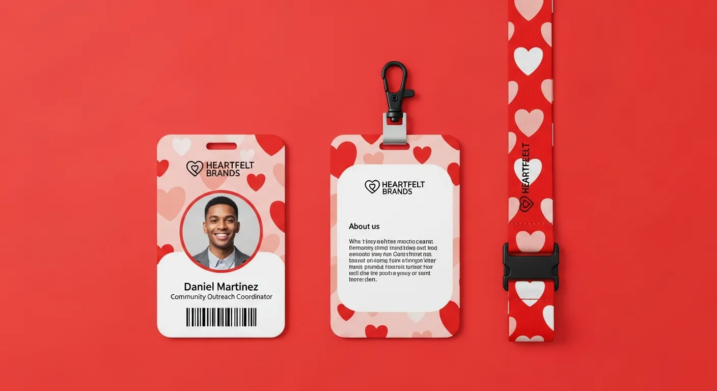
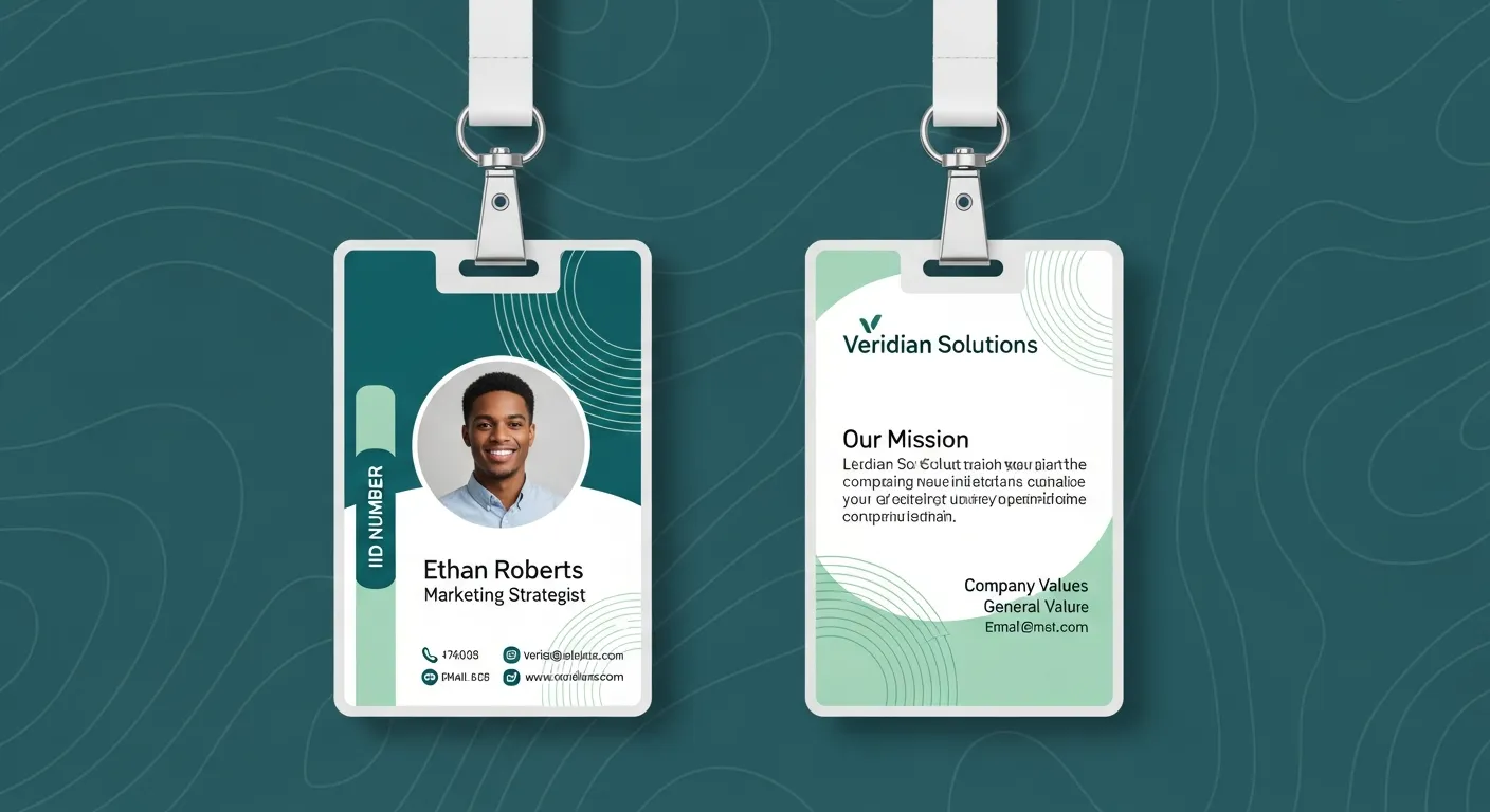
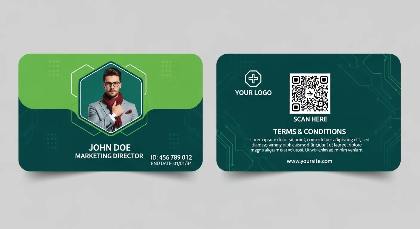
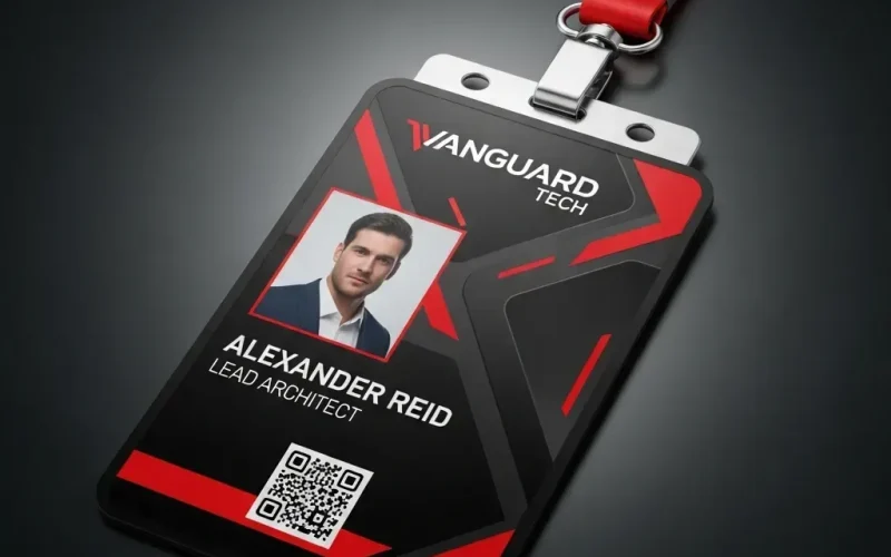
In our world today, where instant digital communication dominates, the business card might seem like an artifact from a bygone era. But the truth is, this small rectangle of paper (or plastic, or even wood) still holds immense power. It’s not just a tool for exchanging contact information; it’s a silent ambassador for your personal or professional brand.
Business card design is not just the process of arranging your name and phone number on a piece of cardboard. It is a delicate and balanced mix of “Art” and “Science.” The art lies in the aesthetics, the impression, and the feeling the card leaves in the recipient’s hand. The science lies in color psychology, information hierarchy, readability, and strategic space planning.
This article will dive deep into both aspects, exploring how brilliantly designed “business cards” can open doors, build bridges, and leave an unforgettable impression in an attention-based economy.
Why is Business Card Design Still Important in the Digital Age?

Many wonder: “Why do I need a paper card when I can send my information via LinkedIn or AirDrop?” The answer lies in human psychology and tangible interaction.
-
The Power of Tangibility: In a world full of cold glass screens, a physical card provides a tangible connection. Giving someone a business card is a deliberate gesture, a professional “protocol” that creates personal interaction. The feel of the paper, its weight, and the print quality; all these elements send subtle messages about your seriousness and attention to detail.
-
A Direct and Immediate Marketing Tool: Business cards are pocket-sized direct marketing tools. They don’t need a battery, don’t require an internet connection, and can’t be “closed” with a click. When attending a conference or meeting, exchanging cards is faster and more professional than trying to spell out your name into someone else’s phone.
-
Brand Reinforcement: A business card is a visual extension of your identity. Whether you are a Freelancer or part of a large corporation, business card design gives you the opportunity to reinforce your brand. The colors, fonts, and logo must be consistent with your entire visual identity (your website, your social media profiles).
-
Professionalism and Credibility: Arriving at a meeting prepared with a well-designed business card shows you are serious and ready. Conversely, apologizing with “I don’t have a card, just look me up” can be interpreted as a lack of preparation or disinterest.
The “Art” in Business Card Design: Beyond Aesthetics

This is where the art of design shines. This aspect is responsible for the emotional “first impression.” It’s not just about whether the card is “pretty,” but whether it’s “appropriate” and “memorable.”
Color Psychology
Colors are not just decoration; they are a language. Your color choice can instantly change how you are perceived:
-
Blue: The most common color in the business world. It suggests trust, reliability, and professionalism (ideal for consulting, technology, and finance).
-
Black: Represents power, luxury, and authority. A matte black card with silver print can be the peak of elegance.
-
White: Symbolizes purity, simplicity, and (Minimalism). It’s an excellent background that makes other elements stand out.
-
Red: A strong, bold color. It grabs attention and represents energy and passion. It must be used with caution (as an accent) because it can be aggressive.
-
Green: Associated with nature, growth, health, and money. Great for environmental or financial brands.
The Art of Typography
Fonts are your written voice. They can shout, whisper, or speak seriously.
-
Serif Fonts (e.g., Times New Roman, Garamond): They have small “tails” at the end of the letters. They suggest tradition, reliability, and respect. Excellent for lawyers, academics, or luxury brands.
-
Sans-Serif Fonts (e.g., Arial, Helvetica, Roboto): Clean, modern, and simple. They suggest clarity, efficiency, and forward-thinking. They are the safest and most common choice in modern art of design.
-
The Font Rule: Never use more than two types of fonts. One for the main heading (your name) and another for the text (contact info). The text must be easily readable, so avoid very small fonts (nothing smaller than 7-8 points).
Creativity in Materials and Shape
The art doesn’t stop at the ink. The texture of the card itself is a message.
-
Weight (Thickness): A thin, light card looks cheap. Investing in heavier paper (300 gsm or higher) gives an immediate impression of quality.
-
Alternative Materials: Don’t stick to paper. Consider transparent plastic, brushed metal, or even laser-engraved wood. These options ensure the recipient won’t forget your card.
-
Shape: Who said a card must be rectangular? Cards with rounded corners look friendlier. A square card looks creative and modern.
The “Science” in Business Card Design: Precision and Strategy

If art is the “reason” someone keeps your card, science is the “guarantee” they can use it. This aspect is about function, clarity, and precision.
Information Hierarchy
Not everything on the card is equally important. You must guide the reader’s eye. An effective business card design process follows a clear hierarchy:
-
Level One (Most Important): Your name and logo. This is what the eye should see first.
-
Level Two (Supporting): Your title or specialty (e.g., “Web Developer” or “Marketing Manager”). This provides context.
-
Level Three (Details): Contact information (phone, email, website).
Failure in this hierarchy leads to “visual chaos” that makes it hard to find information quickly.
The Power of Whitespace
Whitespace (or negative space) is the empty space between elements. Design beginners tend to hate it and try to fill every pixel. Professionals in the art of design love it.
Whitespace is not “wasted space”; it is a design tool. It’s what gives elements “room to breathe,” making the design look clean, elegant, and easy to read. A cluttered card looks desperate and cheap.
The Science of Sizing and Safe Area (Sizing and Bleed)
Precision here is absolute. When sending a file to print, you must understand three terms:
-
Bleed: If you have a color or image that extends to the edge of the card, it must actually extend “beyond” the edge (usually 3mm) to ensure no white borders after cutting.
-
Trim Line: The actual size of the card after it is cut.
-
Safe Area: An internal area (usually 3-5mm from the trim line) within which all important text and logos must stay, to ensure they are not accidentally cut off.
Here is a table showing the standard sizes for “business cards” in different regions:
| Region | Size (mm) | Size (inches) | Aspect Ratio |
| North America (US/Canada) | 88.9 × 50.8 mm | 3.5 × 2 inches | 1.75 |
| Europe (ISO Standard) | 85 × 55 mm | 3.346 × 2.165 inches | 1.545 |
| Japan (Yōshi) | 91 × 55 mm | 3.582 × 2.165 inches | 1.655 |
| ISO 216 Standard (Credit Card Size) | 85.6 × 53.98 mm | 3.370 × 2.125 inches | 1.586 |
Integrating the Digital World
The science doesn’t stop at printing. Modern business card design integrates the digital:
-
QR Codes: They have become very common. Scanning the code can take you directly to your website, your LinkedIn profile, or even save your contact information (vCard).
-
Pro Tip: Don’t make the QR code too small, and have it go to a useful link (not just your homepage).
Spreadsheet: Comparison of Printing and Finishing Options
Your choice of finish can take a card from “good” to “stunning.” This table compares the most common options:
| Finishing Type | Description | Visual and Brand Impact | Cost |
| Matte | Soft surface, does not reflect light. | Professional, elegant, modern. Gives a warm feel. | Medium |
| Glossy | High-gloss, reflective surface. | Vibrant, attention-grabbing. Makes colors “pop.” | Medium |
| Spot UV | Applying a glossy layer to “specific parts” only (like the logo) while the background is matte. | Very luxurious, creates tangible and visual contrast. | High |
| Embossing | Raising parts of the design (like text or logo) above the paper’s surface. | Classic, elegant, adds a tangible dimension. | High |
| Debossing | Pressing parts of the design “into” the paper’s surface. | Subtle, artistic, gives a sense of craftsmanship. | High |
| Foil Stamping | Applying metallic foil (gold, silver, copper) to the design. | Luxurious, represents high quality and luxury. | Very High |
Practical Steps for Successful Business Card Design
Now that we understand the art and science, here is a step-by-step process:
-
-
Define your goal and identity: Who are you? What message do you want to convey? (Are you a creative artist or a serious financial consultant?).
-
Gather your essential information (Don’t clutter):
-
Must include: Name, Title, Company (if any), Phone Number, Email, Website.
-
Can include (Choose wisely): Office address, LinkedIn profile (or one relevant social account), QR code.
-
Should not include: A list of every service you offer, or your fifteen social media accounts.
-
-
f
-
-
Choose the orientation: Horizontal (traditional and safe) or Vertical (modern and different)?
-
Start with the “Art”: Place the logo and name first. Choose a color palette and fonts that match your identity.
-
DE
-
Apply the “Science”: Distribute the rest of the information using a clear hierarchy. Leave enough whitespace. Ensure everything is within the safe area.
-
Use both sides: The front for the first impression (name and logo). The back for detailed information, a QR code, or even just your brand color to reinforce it.
-
Proofread: Then proofread again. Then ask someone else to proofread. A typo in a phone number or email makes the card useless.
Common Mistakes to Avoid in Business Card Design
The greatest ideas can be ruined by simple mistakes. Avoid these traps:
-
-
Visual Clutter: Trying to cram in too much information. Remember, the card is an “appetizer,” not a “full meal.”
-
Fonts that are too small: If your potential clients need a magnifying glass to read your number, you have failed.
-
Poor Print Quality: Using a home printer or a very cheap printing service. This screams “amateur” and ruins all your good art of design efforts.
-
Read
-
Inappropriate Design: Using colorful, cartoony fonts if you are a lawyer, or a boring gray design if you are a graphic designer.
-
Literal Template Copying: Templates are useful for inspiration, but using them as-is makes your card look generic and unoriginal.
Many people fail at business card design because they focus on the art and neglect the science, or vice versa.
Conclusion: Your Card is Your Signature
In the end, a business card is more than just a means of contact; it’s a physical memento of your interaction with someone. It’s an opportunity to leave a lasting impression that stays in their wallet or on their desk long after the meeting is over.
 العربية
