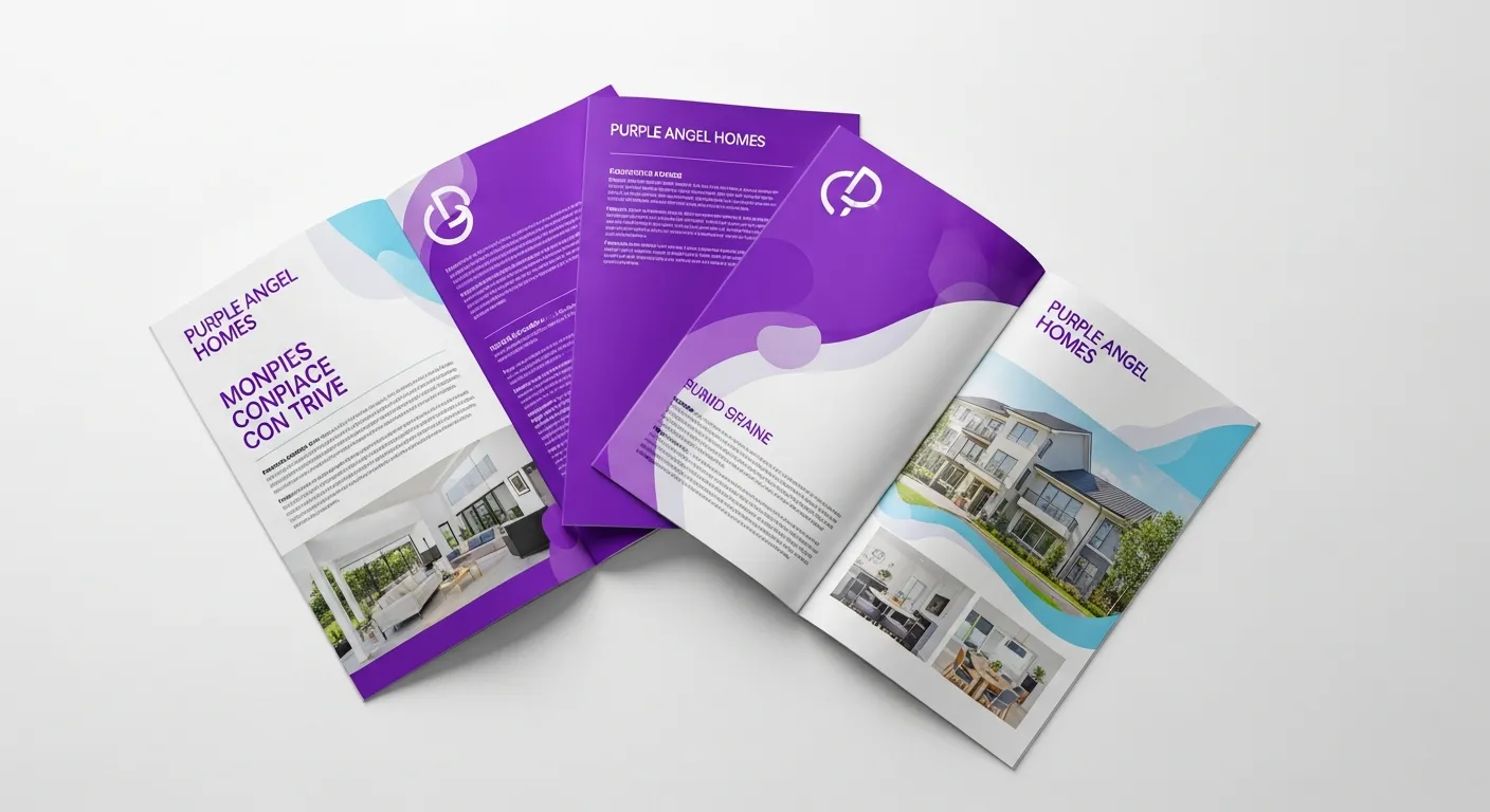
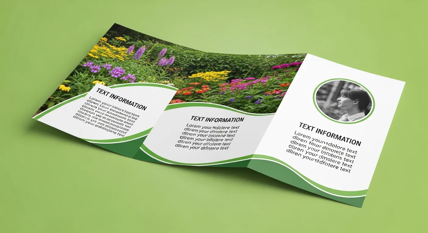
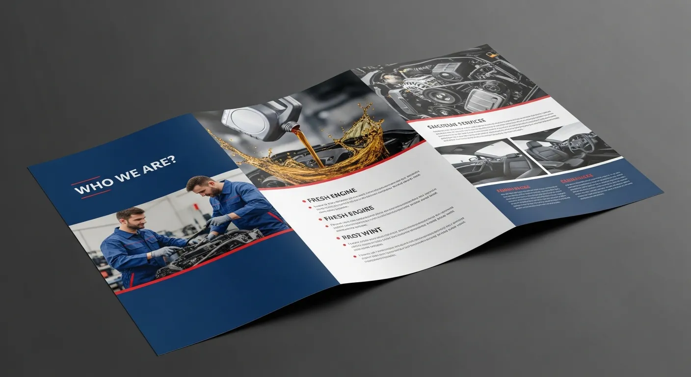
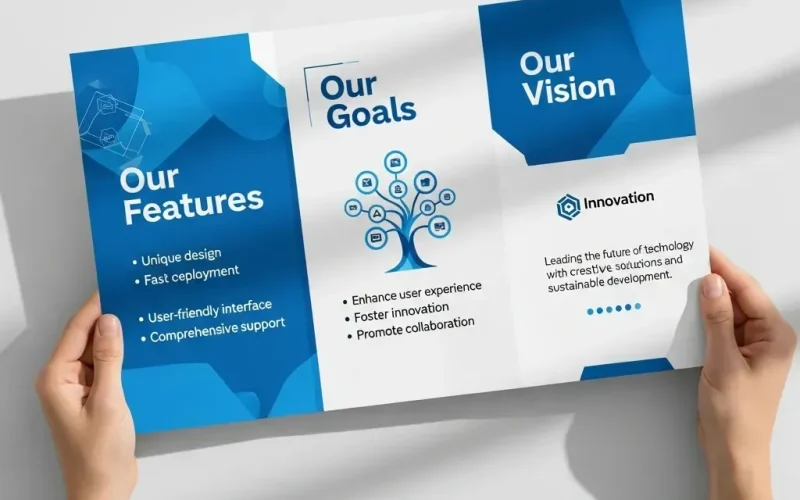
In the world of modern business and marketing, where competition is increasing and the pace of change is accelerating, the printed brochure remains a powerful and tangible marketing tool. The ability to leave a lasting and tangible impression on a potential customer is an indispensable advantage. However, for a brochure to achieve this goal, it must not be just a collection of printed pages, but a carefully considered work of art. Brochure design is both an art and a science, requiring a deep understanding of the target audience and the message to be conveyed.
This article will deeply review 10 essential elements that must be focused on to ensure that your brochure design is effective, attractive, and achieves the desired goals. We will delve into the details of each element, reinforcing the explanation with professional data and recommendations, to ensure the best possible brochure design.

Why is Brochure Design Still of Paramount Importance?
Before delving into the ten elements, we must emphasize the value of the brochure. In the age of digitalization, the power of print is often overlooked. A brochure offers a sensory experience (texture, smell, form), which enhances memory and brand association. It is an asset the customer can keep, unlike a digital ad that quickly disappears. Investing in professional brochure design is an investment in a lasting physical presence for your brand.

The Ten Crucial Elements for Successful Brochure Design
To turn your idea into an effective brochure, these components must be seamlessly integrated.
1. Goal and Audience: The Indispensable Foundation
Every brochure design begins with precise determination of the goal (is it to increase sales, launch a new product, or build awareness?) and the target audience. A brochure directed at business professionals differs radically from one aimed at youth.
Table 1: Comparison of Two Designs Based on Audience and Goal
| Criterion | Brochure for B2B Clients (Companies) | Brochure for B2C Clients (Consumers) |
|---|---|---|
| Main Goal | Building trust and demonstrating professionalism and results. | Emotional excitation and creating immediate desire. |
| Tone and Language | Formal, supported by data and statistics. | Friendly, simple, focusing on personal benefits. |
| Visual Element | High-quality images of products/processes, charts. | Vivid images of happy people using the product. |
| Paper Type | Heavy, matte or semi-gloss (to show luxury). | Glossy, bright colors to attract quick attention. |
2. Key Message and Focus (Clarity is King)
The brochure design must carry one strong, clear message. Do not try to cram everything onto one page. This distracts the reader and weakens the message’s power. Your message must be clear within 5 seconds of viewing it.
3. The Cover: The Unforgettable First Impression
The cover is the most important page. It is the gateway that determines whether the brochure will be opened or discarded. It must combine a powerful image, an attractive headline, and a clear logo. This element is the first thing the reader interacts with regarding the concept of brochure design.
4. Visual Hierarchy
The brochure design should naturally guide the reader’s eye. Use contrast, size, and color to highlight the most important information first, then the second, and so on. This ensures the reader consumes the information in the order you intend.
5. Written Content: Persuasion Before Selling
The content should focus on benefits, not just features. People buy solutions to their problems, not just specifications. The text must be concise, convincing, and directly addressed to the audience. This point is essential for producing an effective brochure.
6. Colors and Branding Consistency
The colors used in the brochure design must exactly match your brand identity (Corporate Identity). Colors evoke emotions and affect consumer perception. Visual consistency enhances trust and professionalism.
7. Printing and Material Quality (The Tangible Aspect)
The quality of the paper and finishing (gloss or matte lamination, gilding, etc.) implicitly conveys a message about the quality of your services or products. A cheap-looking brochure suggests cheap service, regardless of the written content. Brochure design is incomplete without choosing the appropriate printing materials.
8. Images and Graphics: Quality Speaks for Itself
Avoid generic Stock Photos as much as possible. Use professional images that reflect your real products or services. Images must be high-resolution and directly relevant to the accompanying text. Weak images ruin the best brochure design.
9. Clear Call to Action (CTA)
What do you want the reader to do after finishing reading? Do you want them to call you? Visit your website? Scan a QR code? The Call to Action must be clear, easy to execute, and placed in a strategic location, often on the last page or the final inner page. This is the ultimate measure of the effectiveness of brochure design.
10. Formatting and White Space
White space (unprinted void) is not just air; it is a vital design element. It helps the eye breathe, highlights important elements, and makes the brochure design look less cluttered and more professional. Overfilling reduces the perceived value of the content.

In-Depth Analysis of Additional Essential Elements in the Brochure Design Process
To reach a professional level, you must look beyond the ten mentioned above and improve execution.
The Importance of Contrast and Typography
Fonts play a major role in text readability. You should choose two or at most three fonts: one for titles (bold and eye-catching) and one for the body text (clear and readable even in small sizes). There must be sufficient contrast between the font color and the background color. This ensures a comfortable reading experience, making the brochure closer to being an effective brochure.
Using Data in Brochure Design (Professionalism through Tables)
To enhance credibility, simple tables can be used to display comparisons, prices, or timelines. This adds an element of transparency and accuracy.
Table 2: Sample of Including Compelling Data in a Brochure
| Feature | Traditional Brochure (Competitor) | Optimized Brochure Design (Us) |
|---|---|---|
| Target Reading Time | 15 seconds | 45 seconds (due to visual appeal) |
| Recall Rate After One Week | 20% | 45% (due to tangible quality) |
| Color Contrast (WCAG) | Medium to poor | Very high (excellent readability) |
| CTA Inclusion | Absent or weak | Clear and strategically placed (Element 9) |
How Does Brochure Design Contribute to Search Engine Optimization (SEO)?
Although the brochure is printed, the concept of Search Engine Optimization (SEO) applies to how the brochure content is searched for online. Ensure that any PDF files published on your website as a digital copy of the brochure contain:
- Indexable text (not an image of text).
- Targeted keywords (such as Brochure Design and Essential Elements).
- Good Alt Text for images within the digital file.
Conclusion: Investing in Integrated Essential Elements
Effective brochure design is not just a matter of aesthetic taste; it is a carefully considered marketing strategy based on 10 integrated essential elements. Starting from defining the audience and goal, through clear messaging and visual contrast, and culminating in printing quality and a direct Call to Action. When these elements are mastered, the brochure transforms from a mere printed paper into a silent and convincing ambassador for your brand, guaranteeing the production of an effective brochure that achieves a return on investment.
 العربية
